%402x.svg)
This portfolio is engineered to communicate my specialisation in in sensory design and front end development, a trajectory identified by synthesising my musical background with web design. The sites funcion is to serve as a showcase of myself, one that is competent across all three learning outcomes.
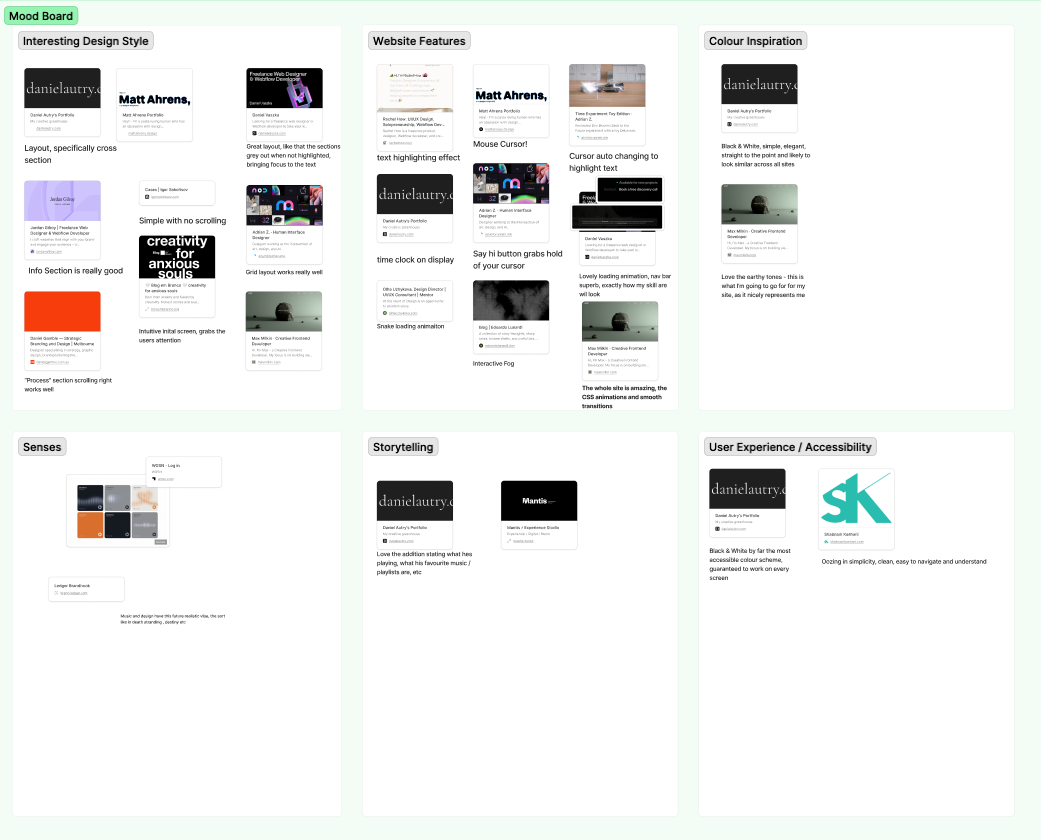
Upon exploring and collating a variety of sites, I rejected an initial idea of high energy display, with a more minimalist and structured aesthetic, as seen by Daniel Lautry's site (Autry, D. (no datethe sites high cognitive ease allows the work to be the focal point, backed up by (link to good study). The subtle design allows these sites to be accessible.
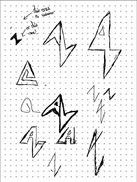
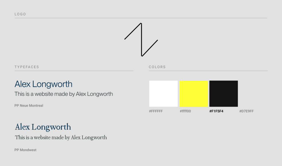
Early sketches of the site played with different styles of layout and potential animations, I wanted something that could grab the user attention subtly and adhere to WCAG accessibilty guidlines, and followed a maximum of three click to connect sitemap wherever possible. My logo wa aimed for a sleek, modern feel allows for future variations and the simple design allows the logo to easily be used as a scalable vector graphic (.svg).

My foundational site build for Locked Off hilighted the time constraints and often sluggishness of manual coding. Instead of sitting through hours of coding tutorials, WebFlow (Webflow, 2025) allows me to focus my time on the more crucial aspect of what I do - design. Unlike traditional CMS platforms, Webflow contains semantic HTML and CSS that is clear and understandable, all categorised and organised into components, styles, elements in a layout that is easier to understand than a page of code. Users can upload their sites to a marketplace, which I have utilised as foundations for my own designs - see the bibliography for full list of templates I've used for foundaitonal components (all templates used are permitted for cloning). The program not only allows me to learn how code works through their organisation of web elements and components, but crucially allows the option to embed custom code, a hybrid approach that will be key when my coding ability is seasoned and I can implement my own custom scripts, CSS and the likes. Webflow is being increasingly recognised for its efficiency and capability to produce robust, expandable, ready-to-deploy websites, which are industry standard. Choosing webflow aligns my developmental process with modern, efficient workflows, ensuring a final product that meets high professional standards for stability and scalability.
The styleguide for this site is built upon WCAG 2.2 AA standards (World Wide Web Consortium, 2023), driven by the critical importance of accessibility on the web. Animations are kept minimal and undesruptive to functionality, the high contrast. limited colour pallete along with shaders on background images ensures optimal legibility and reduces cognitive strain. All text elements are styled with a good amount of line height and responsive scaling, complying with the modern-day requirements of accessible and ethical design.
Early iterations of my site featured a window opening animation upon scroll; whilst fun to play with, multiple peers highlighted that “when scrolling” animations have potential to cause nausea for people with certain conditions, so it was therefore removed and replaced with a gentle mouse hover animation, that has maximum smoothing and has no effect on functionality. This change reflects a commitment to iterative improvement and prioritising user-centred feedback above my own personal preferences, and ensures a playful yet controlled and distraction free portfolio.
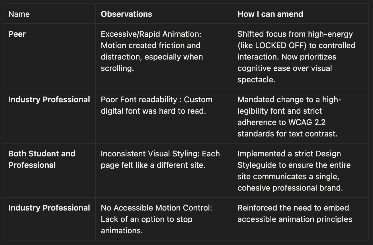
Feedback from two anonymised peers, one student and one industry professional, revealed some critical oversights on issues with my sight during my user testing. The student highlighted the rapid pace and quantity of animations, with no option to stop them was distracting and was causing friction between them and the information on the page, especially when scrolling. This forced a fundemantal shift in how I designed moving forward, as I realised structured clarity and user experience must be priority before designing a high-energy aesthetic. The industry professional higlighted the digital font was hard to read, defining it as “strained reading”. This, along with comments on the inconsistent visual styling, forced a fundemental redesign that prioritised pairing visual elegance with ethichal accessibility.
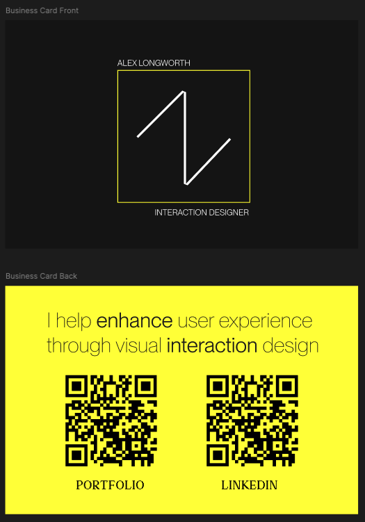
The final site sythesised with my professional social media & business card communicate my specialisation in interaction design, synthesising my upbringing and background in web and user experience design with my background in sound design and djing. Feedback from peers proved vital and allowed me to further ideate on new ways to enhance user experience through interaction design, whilst keeping conformative both ethically and accessibly.
Autry, D. (no date) Daniel Autry’s Portfolio. Available at: https://danielautry.com/ (Accessed: 4 December 2025).
Berry, J. (2024) Dribbble Workshop. Available at: https://webflow.com/made-in-webflow/website/power-of-animation-webflow-dribble (Accessed: 4 December 2025).
Figma (2025) Figma. Available at: https://figma.com (Accessed: 4 December 2025).Granqvist, R. (no date) Simple Portfolio Card Interaction Component. Available at: https://webflow.com/made-in-webflow/website/simple-portfolio-card-interactions (Accessed: 4 December 2025).
Webflow (2025) Webflow. Available at: https://webflow.com/ (Accessed: 4 December 2025).
Webflow (no date) Prospero Ecommerce UI Kit. Available at: https://webflow.com/made-in-webflow/website/prospero-ecommerce-ui-kit (Accessed: 4 December 2025).
WGSN (2024) Key Colour Trends S/S 25. Available at: https://www.wgsn.com/fashion/article/67f3cbe6ed9191bec815e21c#page4 (Accessed: 4 December 2025). (2023) Web Content Accessibility Guidelines (WCAG) 2.2. Available at: https://www.w3.org/TR/WCAG22/ (Accessed: 4 December 2025).
©Websiote made by Alex Longworth using Webflow.